


The latest jobs numbers for July just came out, and before we get to the details, let me just say: I’m worried.
And that emotional reaction probably tells you most of what you need to know.
The headline: we went backwards
The jobs report is the first serious, high-quality indicator of how the economy was doing in July—and the answer is a whole lot worse than expected.
Markets were expecting job growth of around 80,000. Moderate, unexciting. Instead, we lost 23,000 jobs. That wasn’t in the script.
Now, I don’t want you to overreact and conclude the overall economy is shrinking—these numbers bounce around like crazy. But today is the day to update your sense of how the economy is doing.
And if you’re not saying “crikey, I’m a little bit worried right now,” you’re not paying attention. Or you’re not Australian enough to say crikey.
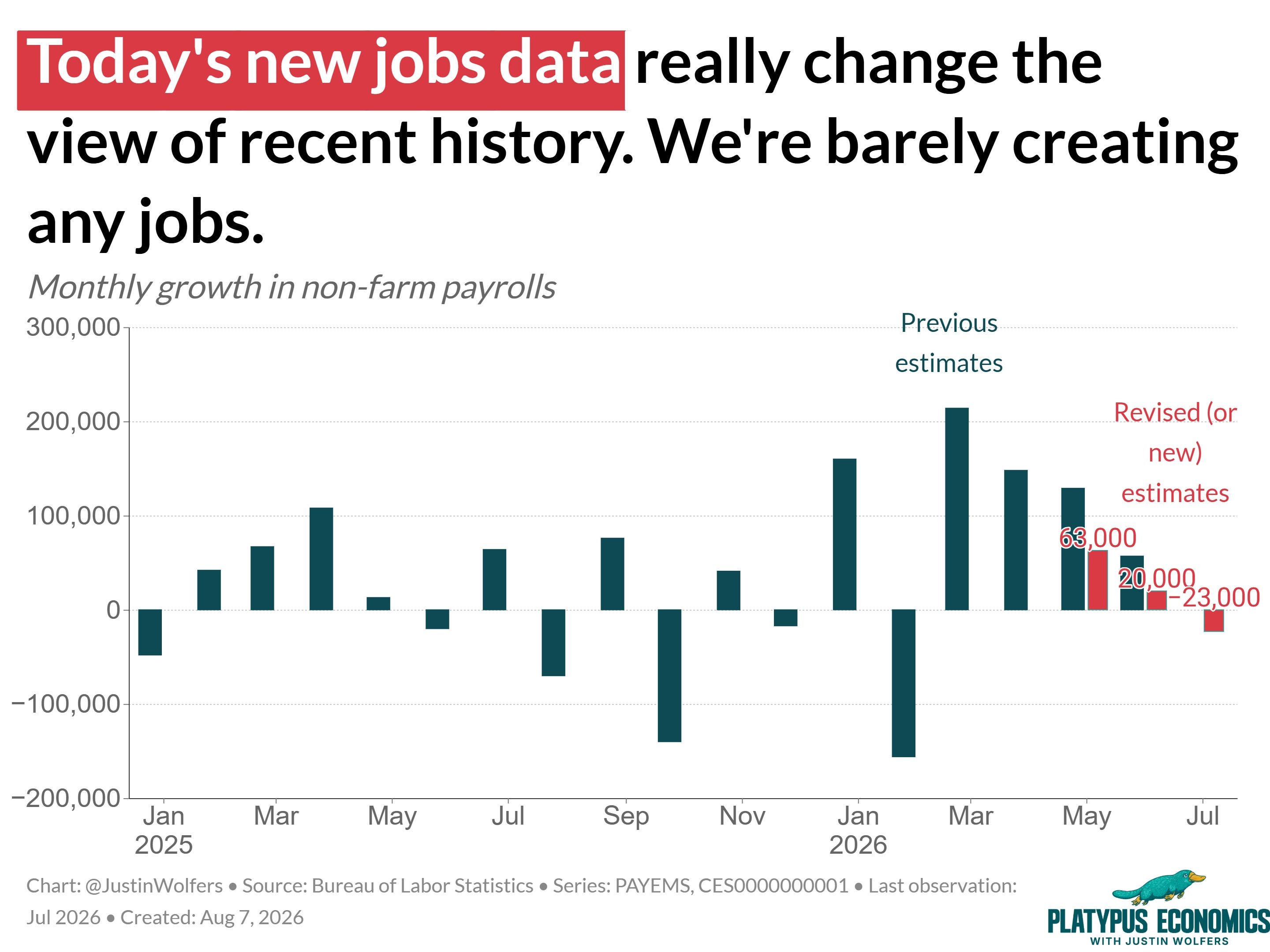
Also, the negative July number wasn’t the only bad news.
We also learned that the somewhat rosier numbers from the previous two months reflected incomplete data. That’s normal and totally okay—the Bureau of Labor Statistics has since heard back from more firms about their payrolls growth, and so it has revised the data for May and June.
The answer: Businesses were hiring far fewer people than we thought.
So, this month came in roughly 100,000 below expectations, and the prior two months in total were revised down by another 100,000. Put it all together and that’s about 200,000 fewer jobs than we’d hoped.
Now, there’s one piece of this that may be more of a technical blip than anything. While total employment fell by 23,000, that reflects a loss of roughly 53,000 government jobs, nearly all of which were in local government education. That is, schools.
Now if there’s one thing we know about school teachers, it’s that the number on payrolls is highly seasonal (they get the summers off!). Of course, these numbers are seasonally adjusted precisely to account for teachers being off in July. But as those seasonal patterns shift, the statistical adjustments can get a little fluky (some schools ran longer than usual this year due to snow days).
So I’d treat the local government decline as more noise than signal.
An economy in scrubs
Let’s zero in on the private sector instead: it gained 30,000 jobs. That’s not a loss, but it’s also not exciting.
And here’s the most striking story about the US labor market right now: ours is a healthcare and social assistance economy. That sector keeps growing. We’re a rich, aging economy, and what do people with money and time do? They go to the doctor. A lot. Add in hospitals and the rest of the sector, and it’s not surprising this is growing—that’s a long-term story.
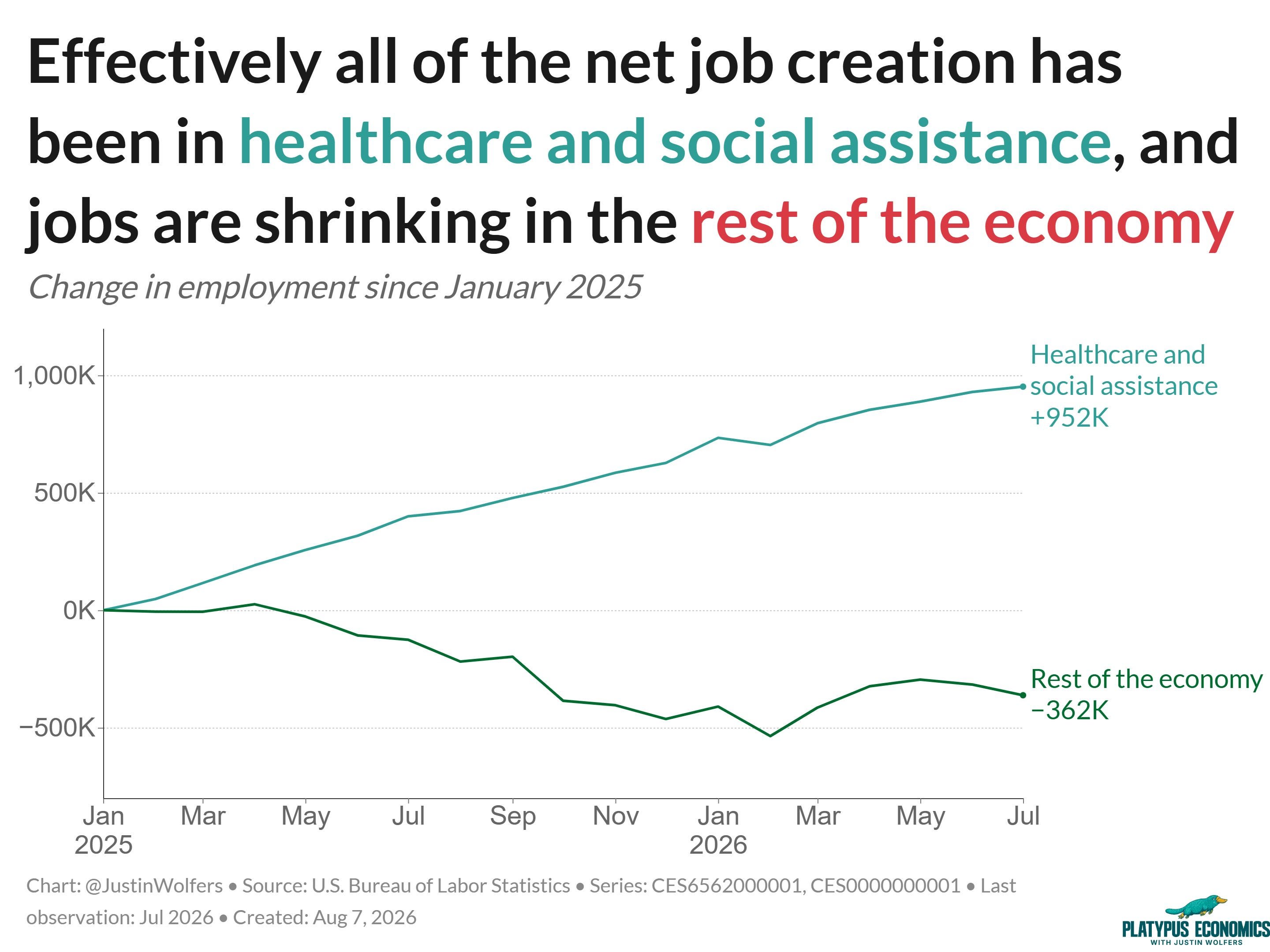
But what’s really striking is that essentially all of the job creation is coming from that single sector. Which means that if you don’t wear a white coat or scrubs to work, you’re in the part of the economy that’s losing jobs. So if it feels like you’re not seeing job growth where you are, the numbers agree with you.
I want to be careful: I’m not saying that without the healthcare boom, the rest of the economy would be shrinking. The healthcare sector is growing by pulling workers from the rest of the economy; if it weren’t, many of those employers would probably have held onto their people. But the growth is still very, very unbalanced.
This is a pink-collar labor market—as the care economy keeps growing—even as the administration tries to tell a blue-collar story. (White-collar readers wondering where you fit in: there’s an ongoing AI story that’s going to be unbelievably important over the next few years. It’s still too early to read it in month-to-month numbers, so I won’t.)
The Pink-Collar Economy Is Here

Since Donald Trump returned to office, nearly all — 86%, to be precise — of net new payroll jobs have gone to women. What’s more, women now outnumber men in non-farm payroll jobs, making up 50.02% of the total.
Unemployment fell—for the wrong reasons
Here’s the other piece of “good” news: the unemployment rate fell to 4.1%, its lowest level in two years. I hate unemployment. I love it when the rate goes down. But I’m still not happy.
Here’s why. The unemployment rate measures the number of people looking for work who can’t find it, as a share of the labor force. One way for that number to fall is for people to simply give up looking. Stop searching, and we no longer count you as unemployed.
The tell is the labor force participation rate—and it has plummeted in recent months.
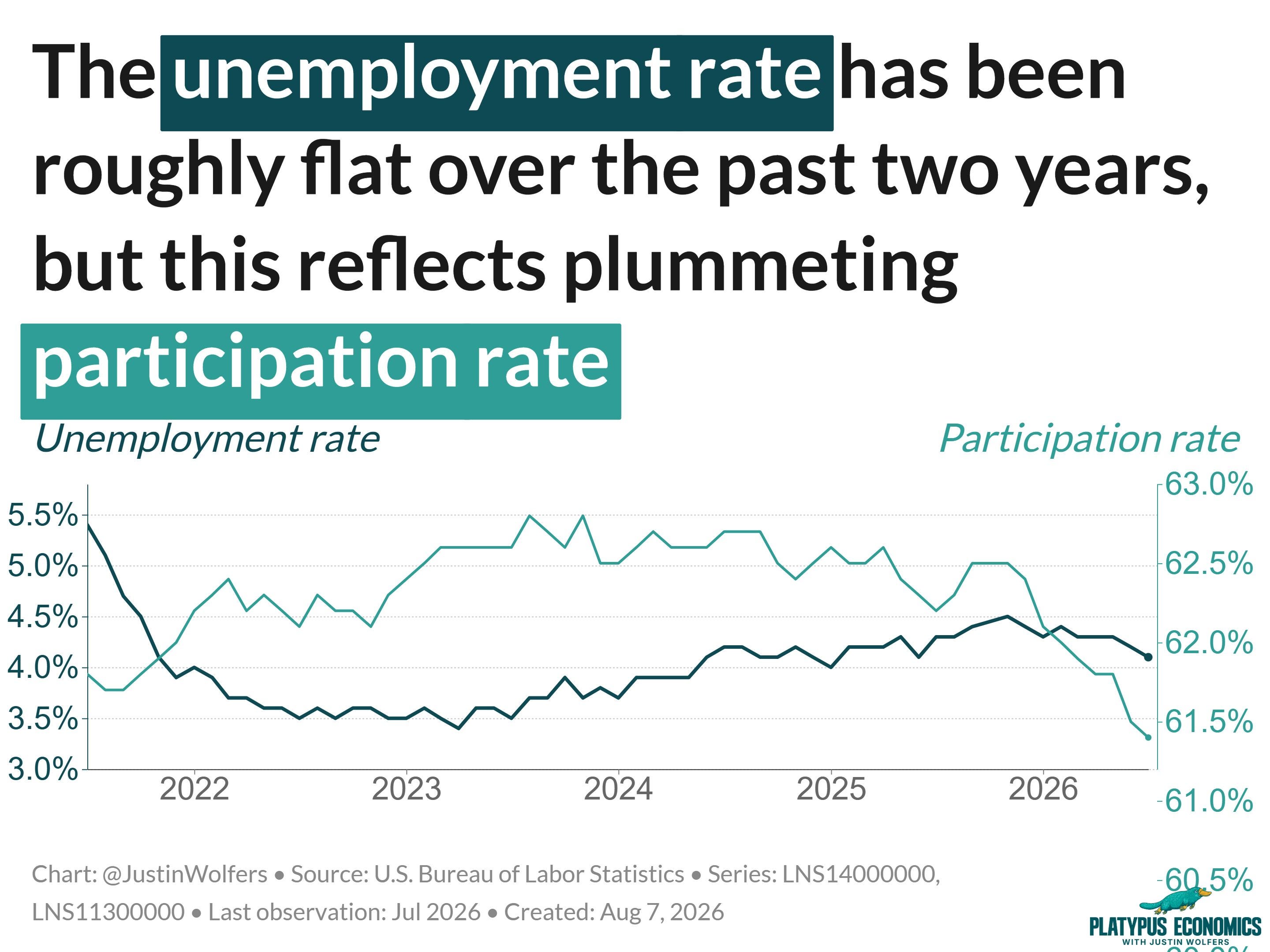
This is what economists mean when they say the unemployment rate fell “for the wrong reasons.” Nothing to write home about. More than that: That declining participation rate gives us a lot to worry about.
A statistical asterisk: two surveys, two stories
Now for a wonkier worry. We measure employment two different ways.
The first is the payroll survey: the BLS asks a whole bunch of businesses how many people are on their payrolls. Because big firms employ a large chunk of workers, this survey covers a lot of ground, and so it gives us the most reliable reading of month-to-month changes in employment. It’s more signal than noise. That’s why it’s the focus of most of the headlines.
The second is the household survey: the BLS surveys tens of thousands of people, asking them whether they have work, whether they’re looking, and so on. It’s an independent measure with independent difficulties—to interpret it, you need good estimates of the size and composition of the population, which is complicated.
For month-to-month movements, trust the payroll survey. But over longer periods, the household survey becomes more interesting. And there's a version of the household measure (adjusted to be more comparable to payrolls) that suggests US employment has been falling for several months—maybe longer.
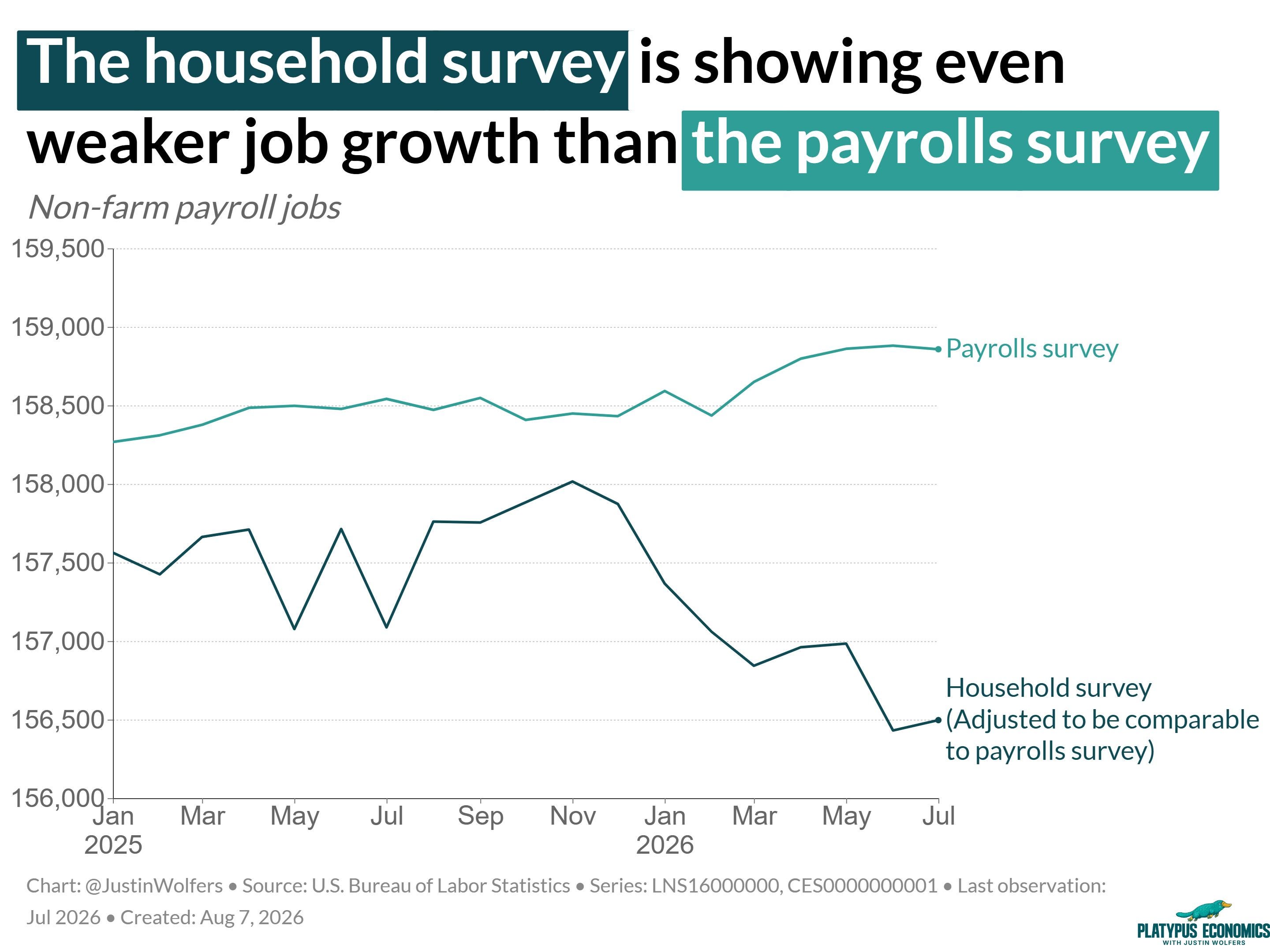
Which one is right? Honestly, it’s hard to know, and that’s the point. I’m not telling you the United States is shedding jobs, but I’m also not telling you it’s not. Economics is hard, and data can be tricky. My point is simply this: we have two independent measures of the state of the labor market, and as negative as today’s headlines look, the alternative says things could actually be a bit worse.
Expect researchers to head down this rabbit hole. It’s a story worth watching.
The view from Canada
Let me put this in perspective with a comparison that’s a little glib but also a little serious: Canada.
Our friends to the north are a reasonable comparison group. They’re right next door, subject to similar economic shocks—in fact, they’ve arguably had it worse recently, because the US started a tariff war and Canada is a very open economy for which that war is a big deal.
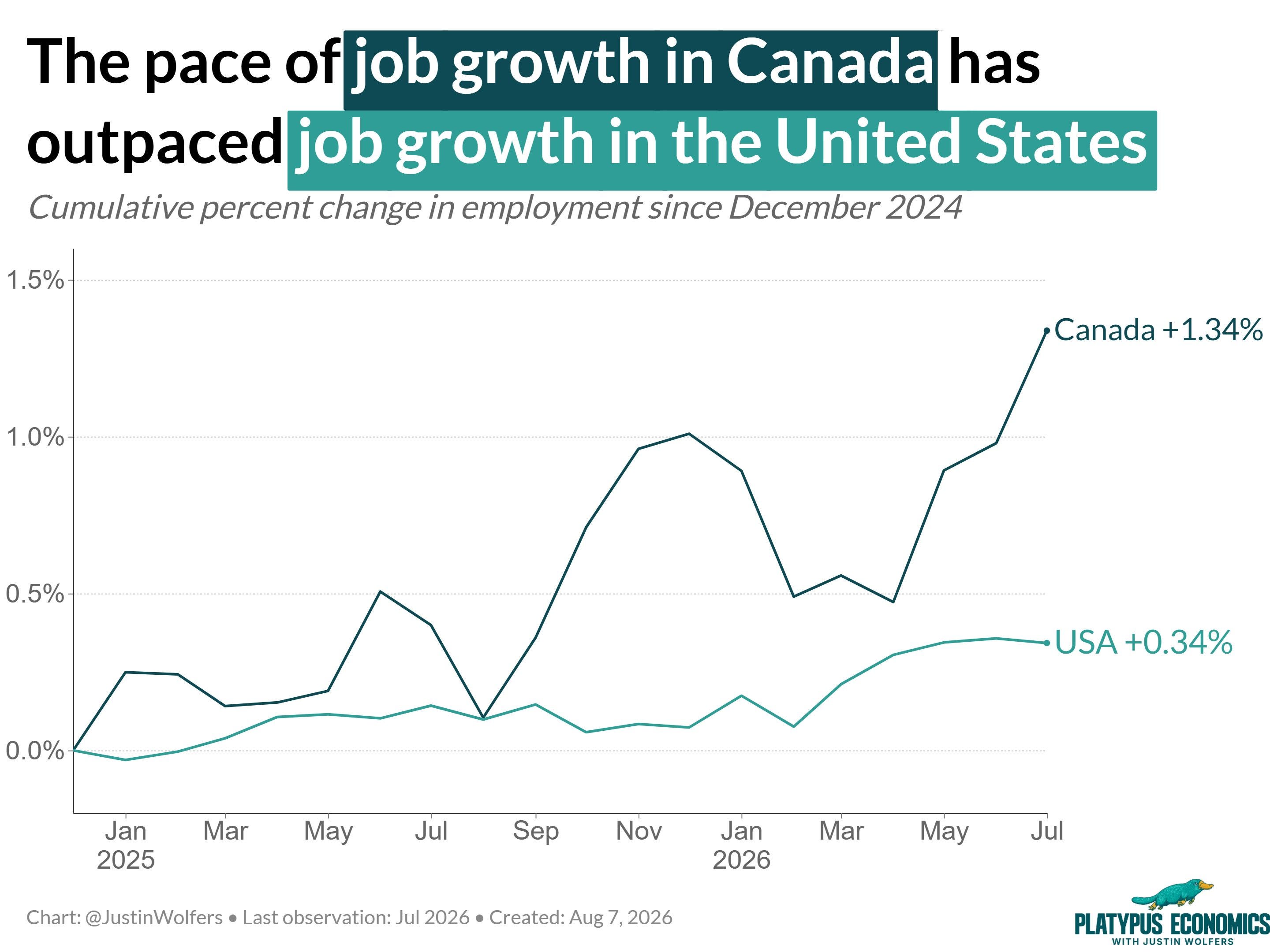
And yet: job growth in the United States has been very weak since January 2025, while job growth in Canada has been substantially faster—roughly quadruple the US rate. In fact, this month, Canada created more jobs in absolute terms than the United States, despite being a much smaller economy.
Part of the difference is immigration: the US is basically giving up on it, and fewer people means fewer workers and fewer customers. Canada still has reasonable population growth, which drives more employment growth. But that’s probably not the whole story.
The point is: whatever story you’re telling about the American economy, you should stress-test it. Would it also predict Canada doing this much better?
What this means for the Fed
The press fixates on how markets respond to these reports, and markets see everything through the eyes of the Fed. (Handsome Kevin likes to think being the strong silent type breaks this. He’s wrong.)
Today made the Fed’s headache worse.
The Fed’s job is to keep both unemployment and inflation low. A month ago, the labor market looked like it was creating enough jobs that unemployment wasn’t going to be a problem anytime soon, leaving it free to focus on inflation. That logic says: go ahead and raise rates.
But what we learned today is that the labor market has a lot less momentum than we thought, and we may need to worry about unemployment starting to rise over the next few months.
I still think rate hikes are coming eventually, depending on where the economy goes. But all that talk of a September hike has already softened. Fed funds futures provide a reasonable measure of changes in the conventional wisdom. Yesterday they said there was a 55% chance of a Fed hike in September. Today (after the jobs numbers) it’s down to 42%, a meaningful change.
Yes, I believe the numbers
Finally, the monthly reminder: our information environment has gotten utterly distorted. When the economy generated good news these past few months, my friends on the left told me the numbers were being faked. It wasn’t true then, and it’s not true now.
These data are generated using the exact same process used under the Biden administration. There is no sign of political meddling that anyone can see.
I understand the urge—the White House lies to you frequently—but these numbers come from an independent statistical agency whose job is to report the truth as best it understands it, including revising numbers when it learns new things.
Some will remind me of a remarkably similar day a year ago: a terrible jobs report, bad revisions, a narrative flip from optimism to gloom—followed by the president, in an utterly unprecedented move, firing the Commissioner of the Bureau of Labor Statistics. The boss of the nerds.
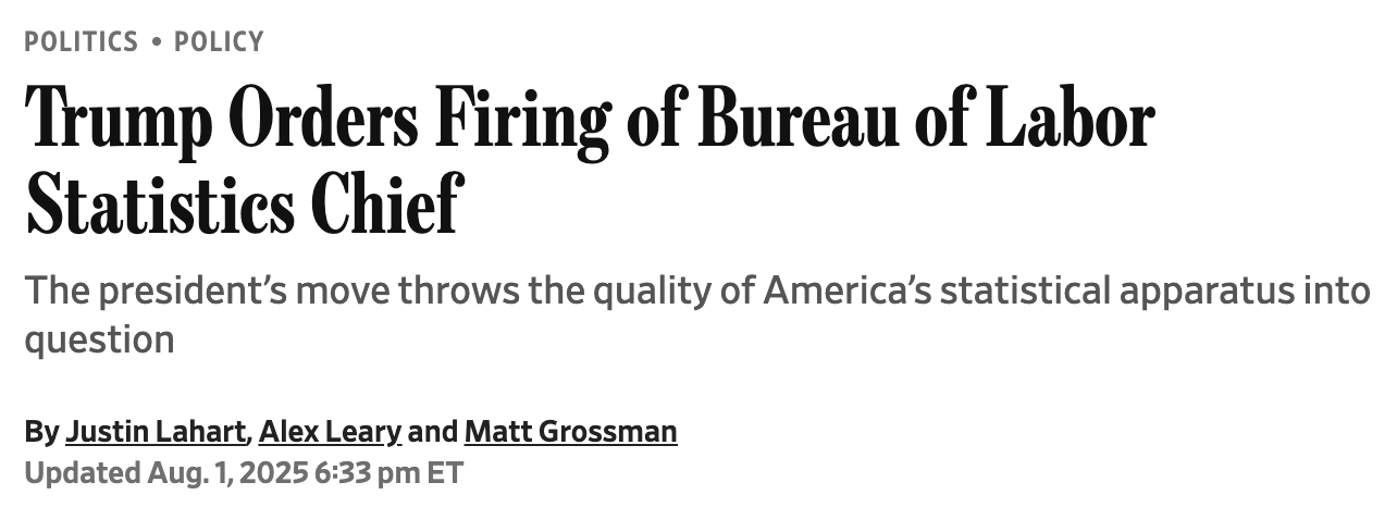
Here’s what happened since: the president tried to install a political hack; the Senate refused to confirm him. A career nerd currently runs the BLS. And the new nominee, Brett Matsumoto, is a very serious statistician who will not be carrying water for the president.
Why I Still Trust the Jobs Report

“Have you been hacked?” “Who got to you?” “Blink, three times if you need rescuing.”
Right now, I suspect Brett’s pretty happy he hasn’t cleared Senate confirmation yet because the President can’t fire a bloke for telling the truth if he hasn’t yet appointed him. But once Brett assumes that new job, days like today might leave him a bit worried about the consequences for his only employment situation if he tells the truth.
But I believe he’ll tell it.
I,too, appreciate your posts. Thanks to your clear explanations, I am learning more economics in a very enjoyable manner.
Thanks Justin for another one of your excellent posts and your accompanying video explaining it all in terms that all us non-economists can fully understand. I never miss reading what you post on your Platypus Economics Substack. Thanks for sharing your expertise and the valuable insights and knowledge you share.