



Another workweek over, another pile of economic news to sort through. I joined Stacey Vanek Smith to comb through the week that was, in a series we call Off the Clock. Think of it as two mates sitting down over a beer and doing what good friends do: look at economic charts and talk about economics.
Before we dig into it: we’re announcing our first-ever Platypus Economics Halloween costume contest! These are economics costumes, so dress as the invisible hand, a deadweight-loss triangle, or Handsome Kevin (if you’ve got the looks). Submit a photo or a short vertical video at platypuseconomics.com/halloween by October 31. You get the chance for fame and fortune as the world recognizes your spooky economic genius. The winner also gets a limited-edition Gus the Platypus pillow.

And if you don’t plan to compete but you’ve got costume ideas, leave those in the comments.
Now back to it. Here are the issues worth a deeper dive this week.
Inflation was worse than expected, and that worries me. The annual inflation rate came in at 3.7%. That’s uncomfortably high. Alan Greenspan once said that you want inflation to be so low you barely notice it. Well, people are noticing.
Energy prices
These are the villains of the inflation report, because they’re driving everything up without an end in sight. Gasoline is up 34% from a year ago. The wholesale numbers in the producer price index, which tell you what’s coming next, are even worse. Diesel is up 115% over the year, and heating oil is up 117%. Expensive heating oil hasn’t hurt much yet, since few people have the heat on. As it gets cold, though, this could mean hundreds of dollars more per month for some folks, particularly in the Northeast, where heating oil is widely used.
The energy story isn’t just about heating our homes and fueling our cars. It’s an input into the rest of the economy, too. Stacey traced a single truckload of Halloween costumes on their way to a Spirit Halloween store and found fossil fuels in the tires, in the asphalt, in the wax lips, in the candy dye, and even in the fertilizer that grew the wheat that went into the truck driver’s sandwich.
Six months ago, I might have suggested looking past the higher oil prices because the war was meant to be temporary. Blips happen. But it doesn’t feel so temporary anymore.
There is a bit of good news
At the start of this year — before the war — the price of a barrel of oil was around $60. Let’s say you take 10% of the world’s oil off the market. That would push the price up to around $100 a barrel. If the world remains in this geopolitical stalemate, unable to get oil across the Strait of Hormuz, then supply will remain restricted and prices will stabilize around this high level. And once prices stop rising, energy stops pushing up the inflation rate, even if the cost of living remains high.
Inflation, Outback style
Imagine Stacey runs an Outback Steakhouse. (By the way, Outback was founded by Americans. No Aussie would put a dessert called Chocolate Thunder From Down Under on a menu.) Anyway, when the economy runs hot, Stacey raises her menu prices. Say the Bloomin’ Onion goes up by 10%. Each server now brings in 10% more revenue, so they’re more valuable (in nominal terms) to Stacey. She has to raise their pay or risk losing staff to her rivals who are also flush with customers. The result: prices and wages rise (roughly) together. That’s the story of demand-pull inflation.
But there’s another inflation story, and it’s more relevant to our current moment. Stacey’s costs suddenly rise, perhaps due to tariffs, or higher energy prices. She raises her prices to protect her profit margin. But higher costs won’t make Stacey’s servers more valuable to her. When one of them asks for a raise, Stacey says no. Her profits haven’t gone up! So prices rise, and wages don’t keep up. That’s called cost-push inflation: it’s all onion, no bloom.
That, unfortunately, is where we are. Wages are rising slower than inflation, so the average American is falling behind. Energy and tariffs are both supply shocks. The Fed can raise rates, but it can’t eliminate tariffs, and it doesn’t control oil prices.
Chart vs Chart
My absolute favorite part of the week is when Stacey and I try to best each other with economic data. We describe our economic lives… in a chart. This week I stripped it back to a single, simple and (I think) elegant chart. Stacey brought Count Dracula. Don’t forget to vote!
Justin’s chart
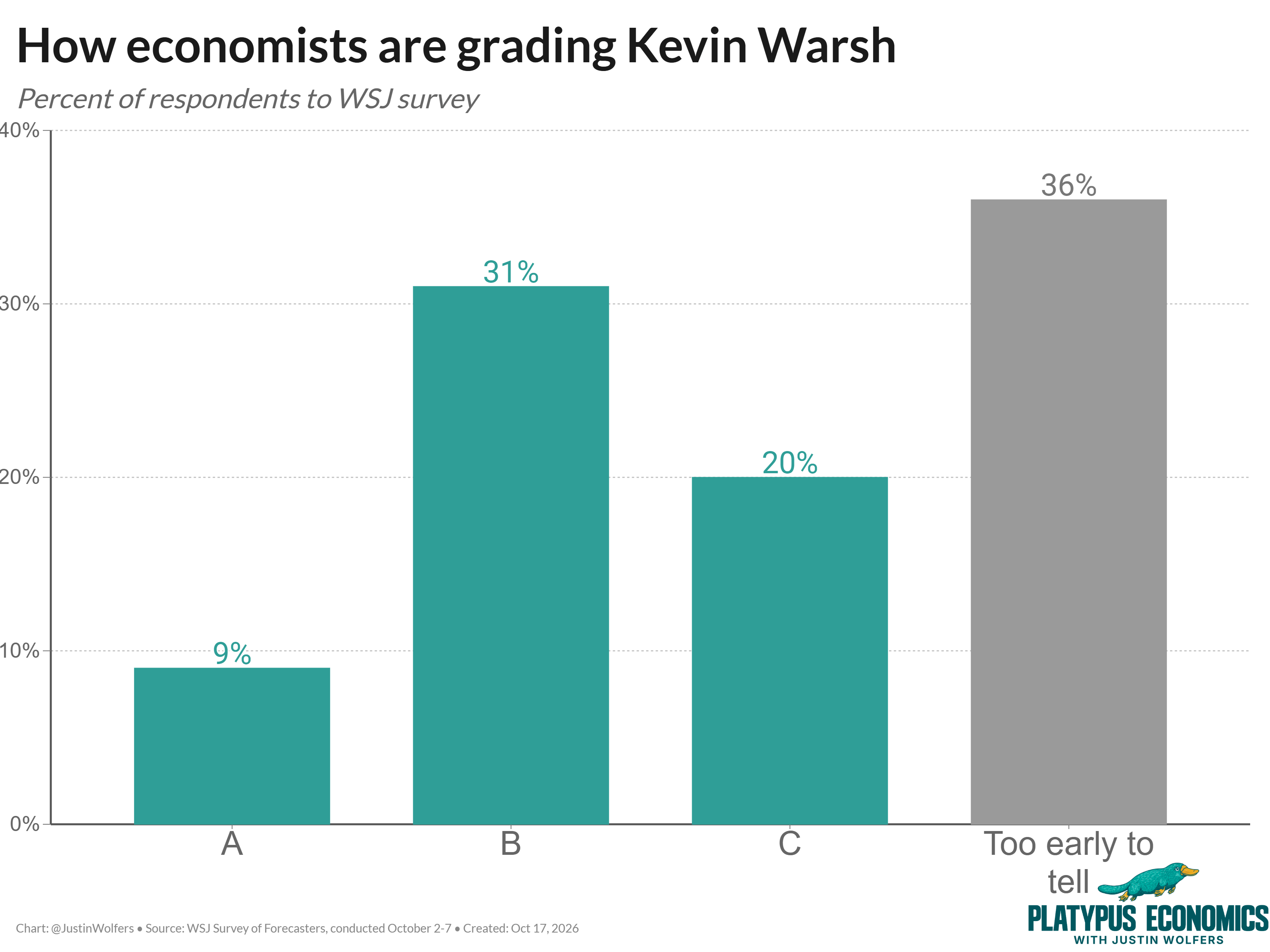
Recently, The Wall Street Journal asked economic forecasters to grade Fed Chair Kevin Warsh. You can see the results below — at this point, “too early to tell” is its own verdict. Personally, I’d give him a B, with a note encouraging him to knuckle down in the second half of the semester.
Stacey’s chart(s)
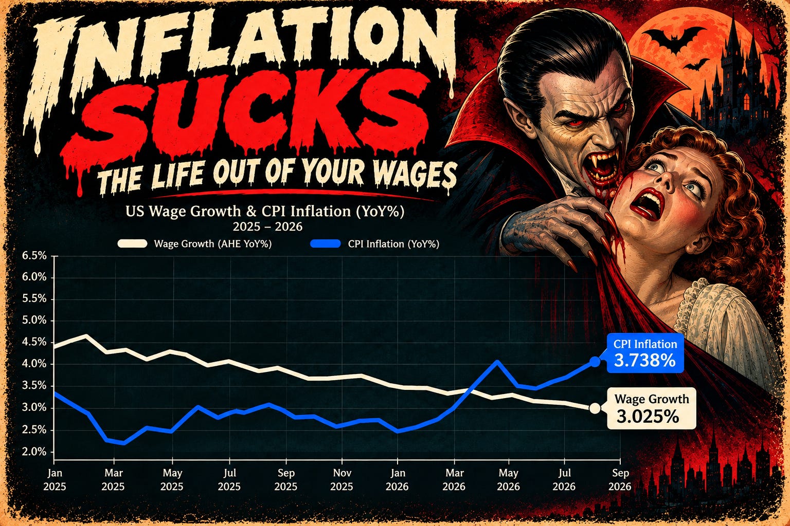
This spring, the lines crossed. Consumer prices are now rising 3.7% a year and wages 3.0%.
Then Stacey went back for seconds and added wholesale prices (aka the producer price index), which are up 6.3%. Those costs often reach store shelves with a lag:
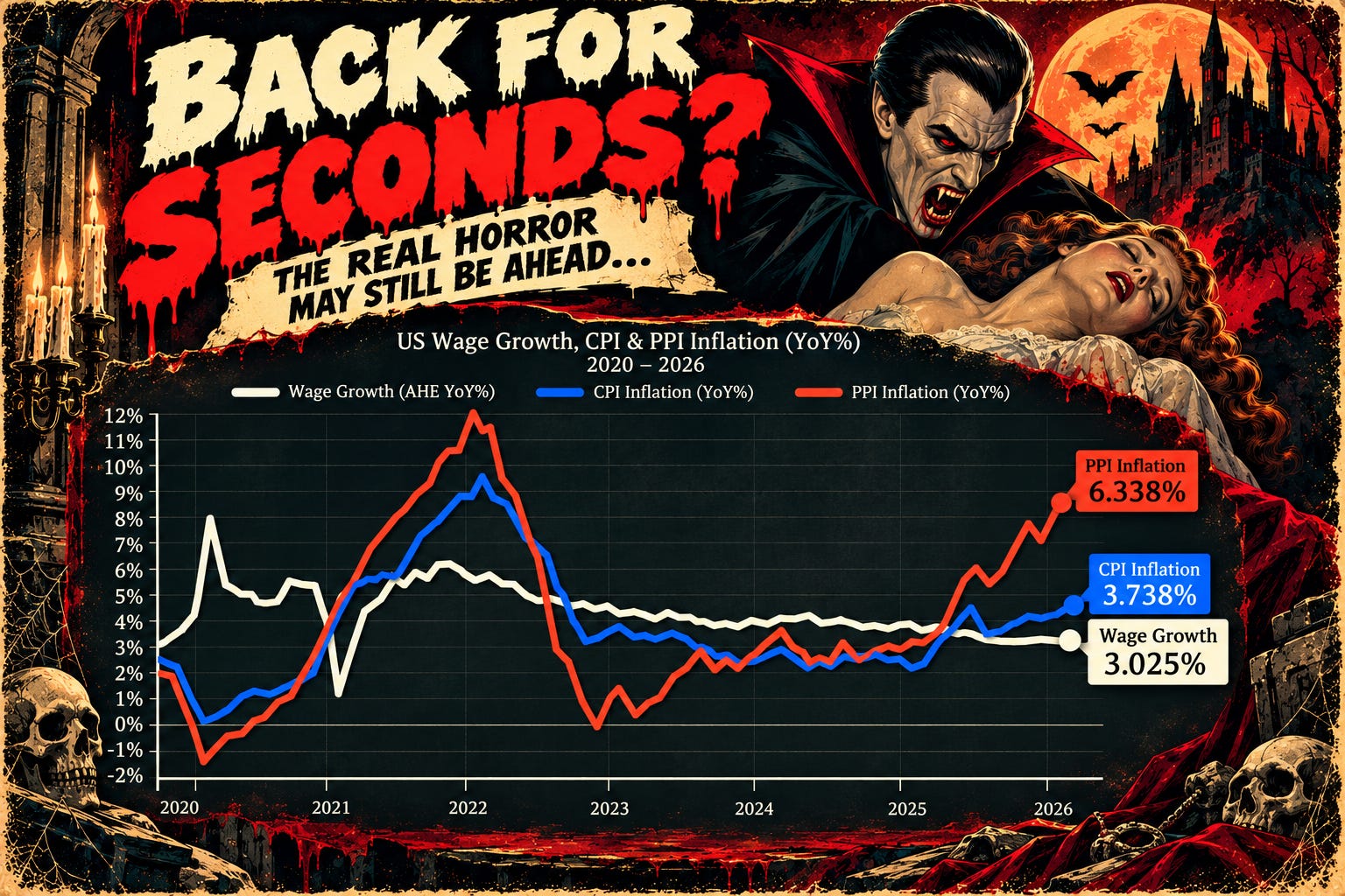
The real horror may still be ahead.
I love this comparison! The chart grading Kevin Warsh is definitely great for the policy wonks, but the Dracula one is a total masterpiece. There is something perfect about visualizing inflation as a wealth-vampire slowly draining our purchasing power—and the 'inflation sucks' caption absolutely nails it. Hard economic data is always a lot easier to swallow when it comes with a side of Halloween humor!
Stacy won, (sorry Justin).