

How to Lie with a Chart, by the U.S. Government
Charts are a beautiful language. Which is why this kind of cherry-picking is such a betrayal

I’ve always hated the expression “Figures lie, and liars figure.” I hate it because the language of figures — of graphs and charts — is a beautiful language, and this is a smear.
You can lie in any language, including charts. But because charts come dressed in the authority of arithmetic, the betrayal often cuts deeper.
And sometimes, the lies are breathtaking.
Take this chart, from the United States Department of Labor. An agency that — until recently — could be trusted to play it straight with numbers.
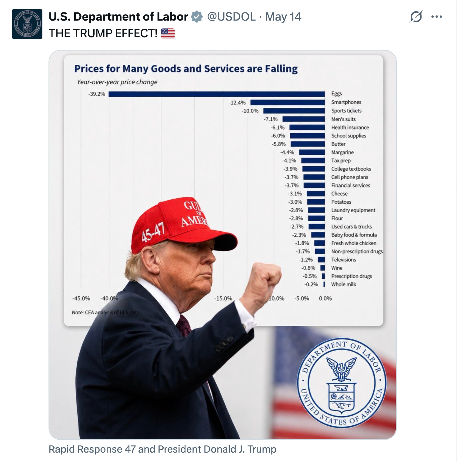
This chart shows that the prices of “many” goods (especially eggs!!!) are falling. But a reasonable person might ask: how much cherry-picking is going on here?
Frankly, it’s the most egregious I’ve ever seen.
To show you why, I took a peek at Table 2 from the latest CPI release. This documents all major price changes over the past year. Then I grabbed every line from that table and made my own chart — putting the Department of Labor’s blue bars in context.
Here goes:
Charts can lie. Liars can chart. And the Department of Labor is now doing both.
Wow. How to paint a clear picture of betrayal in one easy lesson. Thank you.
This is not surprising, but still shocking. The same message is in a NYT video today: https://www.nytimes.com/2026/05/15/opinion/trump-data-war-on-numbers.html